There are interiors where everything is illuminated the same way.
The table.
The walls.
The corridor.
The background.
All at 500 lux.
All equally bright.
All equally “important.”
At first glance, this might seem safe. Functional. Professional.
But the result is often the opposite.
When everything is lit at the same intensity, the space loses hierarchy.
There is no visual silence.
No focal point.
No direction.
Just brightness.
And when everything is bright — nothing stands out.
This is one of the most common lighting design mistakes in modern interiors. In this article, we’ll explore the problem of uniform illumination, why it happens, and how to design lighting that creates clarity, focus, and atmosphere instead of visual noise.
Table of Contents
The Core Problem: Uniform Illumination Without Hierarchy
Many projects default to a single approach: “Let’s light everything properly.”
In practical terms, that often means:
- Even distribution of fixtures
- Same color temperature everywhere
- Same lux level across surfaces
- Same beam angle
- Same visual weight
The logic behind this is understandable:
- Avoid dark areas
- Prevent complaints
- Meet minimum lighting standards
- Ensure safety
But what gets lost is intention.
Lighting is not just about achieving lux levels.
It is about guiding perception.
When every plane in a room receives equal intensity:
- The eye has no priority
- Depth disappears
- Contrast vanishes
- The space feels flat
- Atmosphere becomes neutralized
- Uniform brightness creates visual monotony.
Why “Everything at 500 Lux” Is Not Always Good Design
Illuminance standards (like 300–500 lux for offices or workspaces) are important guidelines. But they are not meant to be applied indiscriminately to every surface.
Lighting an entire room to the same intensity ignores how humans actually see.
Human vision is contrast-driven.
We are naturally drawn to:
- Brighter areas against darker surroundings
- Focused light against shadow
- Highlighted objects within a calmer field
If everything is 500 lux:
- There is no contrast
- The visual field becomes overstimulated
- The brain works harder to find hierarchy
- Fatigue increases
Ironically, over-lighting can make a space feel less comfortable.
Good lighting is not about maximum visibility.
It is about intentional visibility.
The Psychological Impact of Equal Lighting
Uniform lighting often feels safe from a technical perspective — but emotionally, it can feel overwhelming.
Spaces without light hierarchy often feel:
- Loud
- Clinical
- Tense
- Overexposed
- Directionless
It’s similar to a room where everyone speaks at the same volume.
Nothing is emphasized.
Nothing feels special.
In contrast, spaces with layered lighting feel:
- Calm
- Structured
- Comfortable
- Designed
- Intentional
Lighting communicates importance. When everything is equally bright, nothing feels important.
The Fear Behind Over-Lighting
Why do so many projects end up with flat, uniform lighting?
Often, it’s not a technical issue — it’s a psychological one.
Designers, contractors, or clients may fear:
- Dark corners being perceived as “unfinished”
- Complaints about insufficient brightness
- Not meeting expectations
- Making bold lighting decisions
So the safest route becomes: “Let’s just light everything.” But safety is not excellence. Excellence requires decisions. And decisions require hierarchy.
The Solution Part 1: Create Visual Hierarchy
The first principle of strong lighting design is hierarchy.
Not all surfaces deserve equal attention.
Ask:
- What is the primary function of the space?
- Where should the eye go first?
- What architectural elements deserve emphasis?
- What can remain supportive background?
For example:
In a dining room:
- The table may deserve 300–400 lux
- Surrounding walls may need only 100–150 lux
- Background circulation areas even less
In a retail store:
- Product displays are brightest
- Circulation paths are secondary
- Ceiling and structural elements are subtle
- Hierarchy creates clarity.
It tells the eye where to rest.
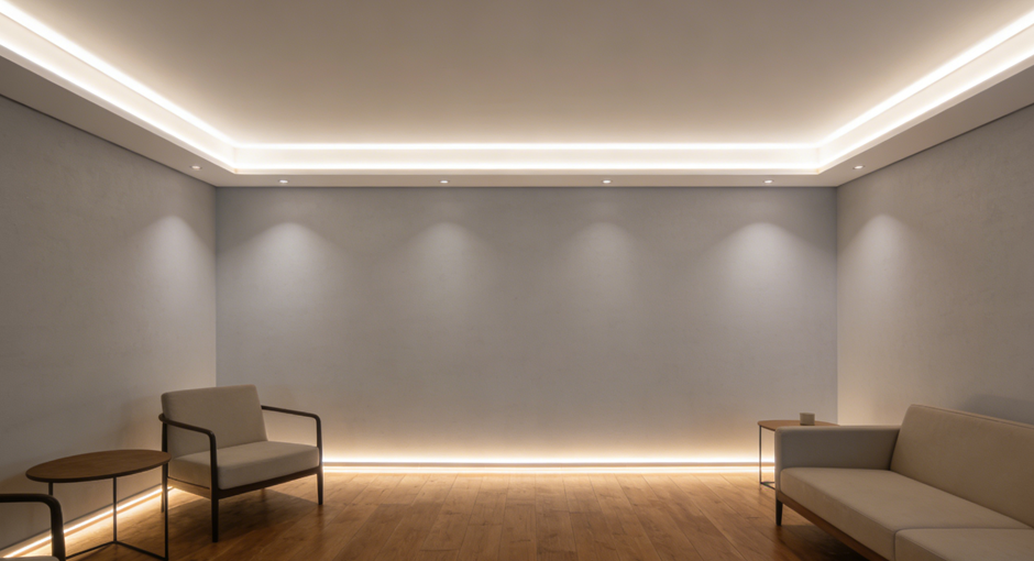
The Solution Part 2: Layered Lighting Instead of Uniform Lighting
Layered lighting replaces uniformity with purpose.
It typically includes:
Ambient Lighting
Provides general brightness and spatial awareness.
This layer should not dominate the room.
Task Lighting
Focused where activities happen: desks, counters, tables.
Higher lux levels are justified here.
Accent Lighting
Highlights artwork, textures, architectural features.
This layer adds drama and depth.
Decorative Lighting
Contributes atmosphere and emotional tone.
When these layers work together:
- The room gains dimension
- Contrast improves comfort
- Visual noise decreases
- The space feels curated rather than flooded
Lighting becomes composition — not coverage.
The Role of Contrast in Comfort
Many people assume brighter equals better. In reality, comfort often comes from controlled contrast. Contrast does not mean darkness. It means variation.
For example:
If walls are 150 lux and artwork is 300 lux, the eye gently prioritizes the artwork.
If everything is 500 lux:
- The artwork disappears into the background.
- Nothing feels intentional.
- Balanced contrast improves:
- Visual interest
- Depth perception
- Emotional engagement
- Spatial orientation
The absence of contrast creates flatness.
Energy and Sustainability Considerations
Uniform high-level lighting also affects energy efficiency.
Lighting all surfaces to 500 lux:
- Increases power consumption
- Raises installation costs
- Generates more heat
- Reduces system lifespan
- Layered lighting allows:
- Lower general ambient levels
- Targeted higher illumination only where needed
- Smarter energy distribution
Good lighting design is not just aesthetic — it is efficient.
Color Temperature Uniformity vs Intentional Variation
Beyond brightness, many projects also apply one color temperature everywhere.
Single-CCT environments can feel static and artificial.
Strategic variation enhances spatial experience:
- Warmer tones in relaxation zones
- Slightly cooler tones in functional areas
- Accent lighting with subtle warmth shift
- Uniform CCT combined with uniform lux intensifies flatness.
Subtle differentiation improves atmosphere without complexity.
Silence in Lighting Design
Great spaces include visual silence.
Not every wall needs highlighting.
Not every corridor needs brightness equal to a workstation.
Silence in lighting means:
- Allowing some surfaces to recede
- Accepting shadow as a design tool
- Trusting focal points
- Letting secondary areas remain secondary
Shadow is not failure.nIt is contrast. And contrast creates focus.
Practical Guidelines to Avoid Over-Lighting
For architects, designers, and contractors, here are practical adjustments:
- Reduce ambient base level to 150–300 lux in many interior spaces.
- Increase task areas selectively rather than globally.
- Use dimming controls to tune balance after installation.
- Create 1:3 or 1:5 brightness ratios between background and focal elements.
- Avoid defaulting to maximum output “just in case.”
- Test lighting at night when contrast perception is strongest.
Design with intent, not fear.
Lighting as Leadership: Direction Over Volume
Lighting design mirrors leadership principles.
If everything is urgent, nothing is urgent.
If everything is highlighted, nothing is special.
Good lighting:
- Establishes order
- Guides attention
- Respects context
- Supports function
- Creates atmosphere
It does not shout. It directs.
When lighting design becomes about “more brightness everywhere,” it loses its narrative power.
But when it focuses on:
- What matters most
- What deserves emphasis
- What can step back
The space gains clarity and emotional resonance.
Conclusion
There are spaces with too much light.nSpaces where every surface is treated equally. Where brightness replaces intention. Where hierarchy disappears.
Uniform illumination is not excellence. It is hesitation.
Great lighting is selective.
Layered.
Purposeful.
It creates rhythm between brightness and shadow.
Between focus and background.
Between speaking and listening.
When everything screams, nothing is heard.
But when light knows where to lead —
the entire space begins to make sense.
Other articles:
12v vs 24v LED strip: which voltage is right for your project?
Which LED Strip Is Better: COB or SMD?
CRI, SDCM & Color Binning Explained: Why Color Quality Matters in LED Strips
What Makes a High-Quality LED Strip? 9 Factors Buyers Must Know
Common LED Strip Lighting Problems and How to Solve Them
Understanding LED Strip Types: Chips, Colors, Voltages & Designs
As a bespoke lighting solution provider, Yiholight specializes in high-quality LED strips and neon flex lights. Our products are engineered for durability, brightness, and ease of installation—trusted by B2B customers across the globe.
Contact us today to explore the best LED lighting for your business!
© [Yiholight] and [www.yiholight.com]. Unauthorized use or duplication of this material is strictly prohibited without express written permission from the site’s author or owner. Excerpts and links may be used, provided full, clear credit is given to [Yiholight] and [www.yiholight.com], with appropriate, specific direction to the original content.